
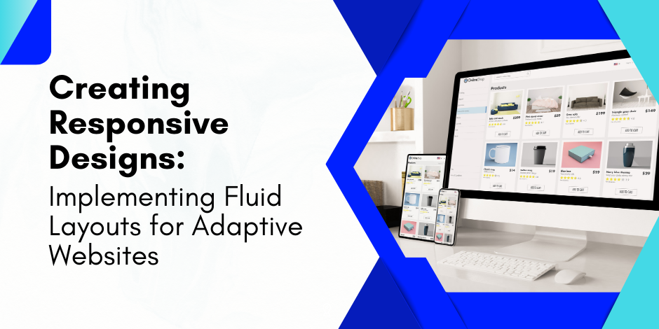
Creating Responsive Designs: Implementing Fluid Layouts for Adaptive Websites
As the digital landscape continues to evolve, the need for responsive design is more critical than ever.
With many devices, screen sizes, and platforms, creating responsive designs and implementing fluid layouts for adaptive websites has become necessary for web developers and designers.
This guide explores fluid layouts for adaptive websites, including the techniques, principles, and best practices for creating layouts that adapt seamlessly to any device.
The importance of fluid layouts for adaptive websites

Before we delve into the nitty-gritty of creating fluid layouts for adaptive websites, it’s essential to understand why they are so crucial in today’s digital landscape.
The proliferation of devices with varying screen sizes and resolutions has made it imperative for websites to be adaptable and flexible.
A responsive design ensures that a website’s layout, images, and functionalities adjust automatically to fit the device on which it is being viewed.
On the other hand, fluid layouts for adaptive websites use relative units instead of fixed ones.
This means that elements on the page are defined in percentages, allowing them to resize proportionally and maintain the design’s integrity regardless of the screen size.
The combination of responsive design and fluid layouts results in adaptive websites that provide an optimal user experience across all devices.
Creating responsive designs: a step-by-step guide

Understanding the viewport
The first step in creating fluid layouts for adaptive websites is understanding the concept of the viewport. The viewport is the user’s visible area of a web page, which varies with the device.
To control the layout on different devices, you need to use the viewport meta tag in your HTML code. This tag tells the browser how to control the page’s dimensions and scaling.
For instance, to set the viewport to the device’s width and disable zooming capabilities, your code would look like this: <meta name=”viewport” content=”width=device-width, initial-scale=1″>.
This can ensure that the layout you design fits well on all screens.
Implementing fluid grids
Fluid grids are a fundamental aspect of creating fluid layouts for adaptive websites.
They use relative units like percentages, rather than fixed units like pixels, to define the width of page elements. This allows the layout to adjust dynamically based on the screen size.
To implement a fluid grid, you need to convert the fixed widths into relative units.
For example, if an element’s width is 900px and the maximum width of the page is 1200px, the relative width would be 75% (900/1200 * 100).
Using fluid grids ensures your design maintains its proportions as it scales up or down.
Creating flexible images
Images are a vital part of any website, and they need to be flexible to fit into a responsive design.
To create flexible images, you can use the max-width property with a value of 100%. This makes the image scale down if it has to, but never scale up to be larger than its original size.
For example, the code to make an image flexible would be: <img src=”image.jpg” style=”max-width:100%;”>. This ensures that your images resize appropriately without distorting the layout.
Testing and optimising your responsive design

Once you’ve implemented your responsive design and fluid layout, it’s essential to test it across different devices and browsers.
This will help you identify any issues and make necessary adjustments to ensure optimal performance.
Various tools are available online that can help you test your design, such as Google’s Mobile-Friendly Test or Responsive Design Checker.
These tools allow you to see how your website looks on different devices and make any necessary tweaks.
Optimising your responsive design also involves improving its performance.
This can be achieved by compressing your images, minifying your CSS and JavaScript files, and implementing lazy loading.
These techniques can help reduce your page load time, providing a better user experience.
Conclusion
Creating responsive designs and implementing fluid layouts for adaptive websites is a vital skill in today’s digital landscape.
By understanding responsive design principles, using fluid grids, creating flexible images, and testing and optimising your design, you can create websites that provide an optimal user experience across all devices.
Remember, flexibility and adaptability are the key to building successful fluid layouts for adaptive websites. As technology continues to evolve, so should your designs.
Want to learn more about making fluid layouts for adaptive websites? Download a copy of the Insitute of Data’s comprehensive Software Engineering program outline for free.
Alternatively, we invite you to schedule a complimentary career consultation with a member of our team to discuss the program in more detail.
